How to Read a T20 Scorecard: Runs, Rates and Context
Worked examples explain strike rate, average, bowling economy and net run rate without confusing invented figures with NPL records.
The largest number on a cricket scorecard is rarely the whole story. A batter can lead a tournament in runs because they faced more deliveries, played more matches, or repeatedly batted in favorable conditions. A bowler can concede few runs because the match situation encouraged caution. Understanding those differences makes a Nepal Premier League discussion more interesting than another list of names in descending order.
This guide uses invented examples to explain the calculations. None of the example figures below are NPL records or results. For actual matches, begin with the tournament scorecard and its date. Use our NPL highest-scores article as a starting point for questions, then check the underlying match details before treating a ranking as current.
Start with the question you want to answer
“Who scored the most?” and “Who batted most effectively?” ask different questions. Total runs answer the first. To answer the second, you need opportunities, scoring pace, dismissals, role and conditions. A season aggregate rewards availability and sustained contribution. An innings comparison concentrates on one performance. Neither is inherently better, but switching between them halfway through an argument produces a misleading conclusion.
Write down the competition, season, format and cutoff date before collecting numbers. Decide whether playoff matches count. Check whether a table includes only the current season or combines multiple editions. A player with a spectacular total across two seasons should not appear beside someone measured across one season without a clear explanation of the difference.
Runs, balls and strike rate
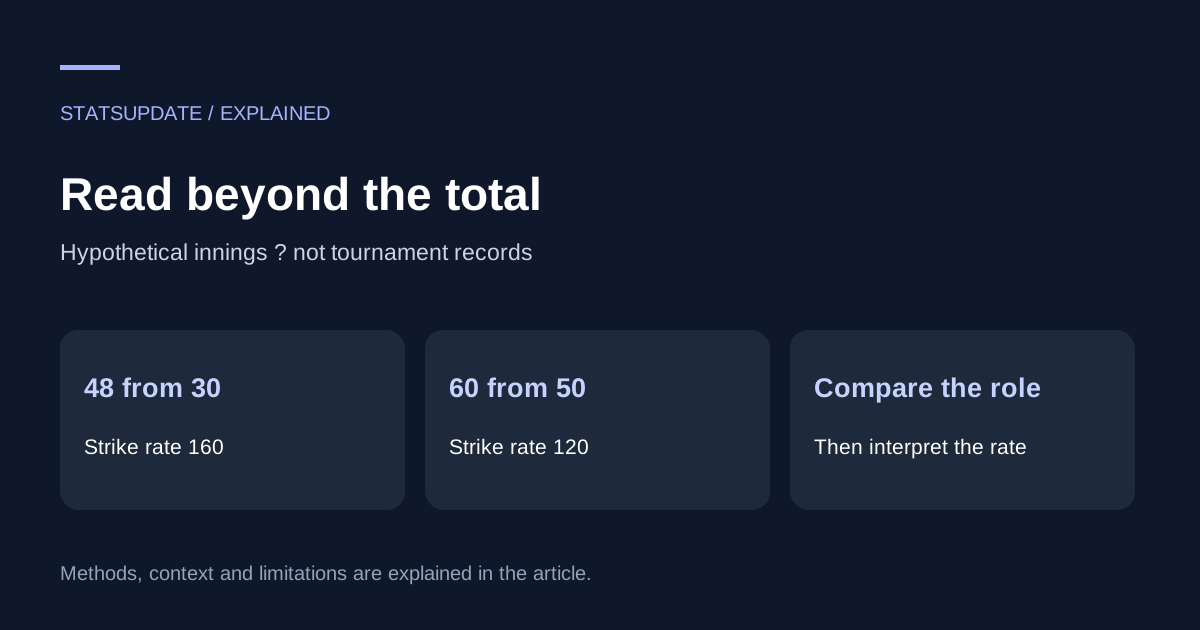
Batting strike rate expresses runs per hundred balls faced: runs divided by balls, multiplied by 100. In our invented example, Batter A makes 48 from 30 balls, giving a strike rate of 160. Batter B makes 60 from 50, giving 120. B contributes more runs, but A scores more quickly. That distinction is visible only when balls faced accompany the runs.
The arithmetic does not decide who played the better innings. If A entered with a strong platform while B rescued a collapse, their jobs differed. Ask when the innings began, what the required rate was, and how much batting remained. Strike rate is a useful description of pace; it does not encode those circumstances by itself.
Why batting average needs dismissals
Batting average divides total runs by dismissals, not innings. Imagine 180 runs across six innings. If the batter was dismissed six times, the average is 30. If they were dismissed three times, the average is 60. The second figure rewards unbeaten innings, but it also means finishers can have a small denominator. Show innings and not-outs beside the average so readers can understand it.
When a player has not been dismissed at all, the denominator is zero. An average should be shown as undefined or a dash according to the source convention, rather than invented as zero or infinity. This is a small presentation choice with a large effect on how a table is read, especially early in a short competition.
Boundaries and the runs between them
Boundary runs are easy to calculate: four times the number of fours, plus six times the number of sixes. Suppose our fictional 48-run innings includes four fours and two sixes. That is 28 boundary runs, leaving 20 runs from other scoring shots. Boundary share is 28 divided by 48, or roughly 58.3 percent.
This can help describe how an innings was constructed, but it cannot tell you how often the batter rotated strike. For that you need delivery-level scoring, including dots, singles and twos. Two innings with the same boundary share may have very different patterns between boundaries. Do not label the remaining runs “singles” unless the ball-by-ball record supports that description.
Overs are not decimal numbers
The notation 3.2 overs means three completed six-ball overs and two additional legal balls: 20 legal deliveries. It does not mean 3.2 in ordinary decimal arithmetic. A bowler who concedes 24 runs in 3.2 overs has an economy rate of 24 divided by 20, multiplied by six, or 7.2 runs per over. Dividing by 3.2 would incorrectly produce 7.5.
Convert overs to legal balls before doing spreadsheet calculations. Wides and no-balls complicate delivery logs because a recorded event may not consume a legal ball. Use the scorecard's official ball count and bowler-conceded runs rather than assuming that the number of rows in a ball-by-ball file equals the number of legal deliveries.
Bowling figures describe different strengths
Bowling economy measures runs conceded per over. Bowling average measures runs conceded per wicket. Bowling strike rate measures legal balls per wicket. Consider an invented spell of 24 runs and two wickets from 24 legal balls. Economy is six, average is 12 and bowling strike rate is 12. Each answers a separate question about cost, wicket-taking and frequency.
Context matters here too. A bowler defending a large total can attack differently from one protecting a small target. Powerplay and late-innings overs carry different tactical demands. Byes and leg-byes are not simply added to the bowler's conceded runs. Read the official figures before reconstructing a spell from the team total, and identify run-outs separately from wickets credited to bowlers.
Net run rate is an aggregate calculation
For ordinary completed matches without special adjustments, net run rate compares a team's aggregate scoring rate with the aggregate scoring rate of its opponents. It is not the average of each match's net run rate. Aggregate runs and the applicable overs first, then divide. Otherwise a short successful chase can receive the same weight as a full-length innings in a way the competition calculation does not intend.
There are important exceptions. The ICC's published net-run-rate provisions use the full allotted quota when a side is bowled out early, and describe treatment for interrupted matches. Consult the relevant tournament playing conditions for the season you are analyzing. Do not transplant a simplified classroom formula into an official league table when reduced targets or abandoned games are involved.
Compare roles before declaring a winner
A practical comparison table should include matches, innings, batting position where available, runs, balls, dismissals and a source link. For bowlers, include legal balls, conceded runs, credited wickets and economy. Add phase splits only when you have reliable delivery data. If a source does not provide an answer, say so rather than filling a blank with a plausible estimate.
Then write the interpretation as a conditional statement: A scored faster over these innings; B contributed more total runs; C maintained a lower economy while bowling these overs. This is more informative than forcing every metric into a single “best player” score. Readers can decide which contribution mattered most without losing sight of the evidence.
A repeatable review workflow
Save the scorecard URL, match date and competition. Transcribe the raw figures before calculating derived metrics. Recalculate one row manually to catch decimal-over mistakes. Keep rounding until the presentation stage, and explain any exclusions beside the table. If you later correct the dataset, retain a note identifying the changed figure and the reason.
Finally, read your headline against your evidence. A list of high individual scores cannot establish the strongest batting team, and one economical spell cannot establish season-long superiority. Our international run-scorers article raises the same issue across formats: totals become meaningful only when the opportunities behind them are visible. Good cricket analysis makes those opportunities part of the story.